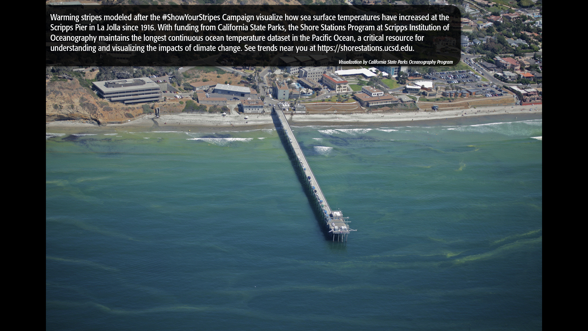
Want to know how ocean temperatures have changed at coastal stations throughout California?
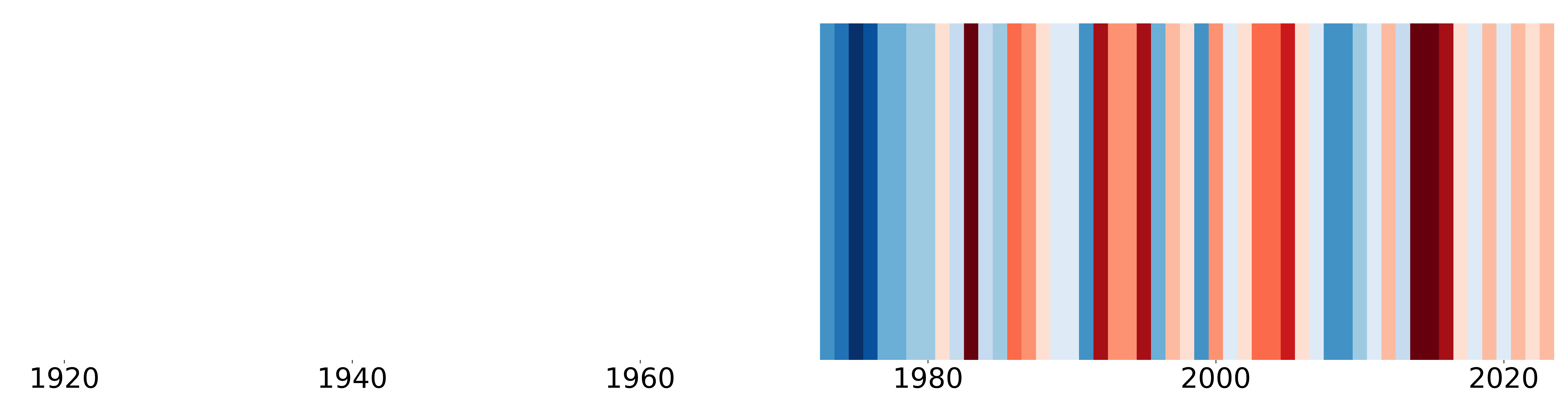
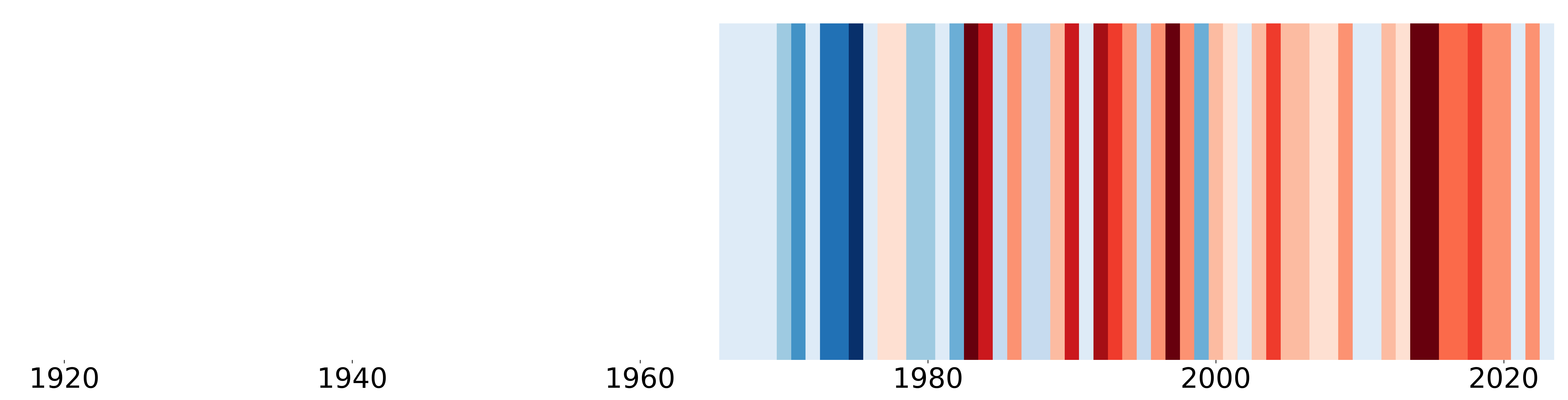
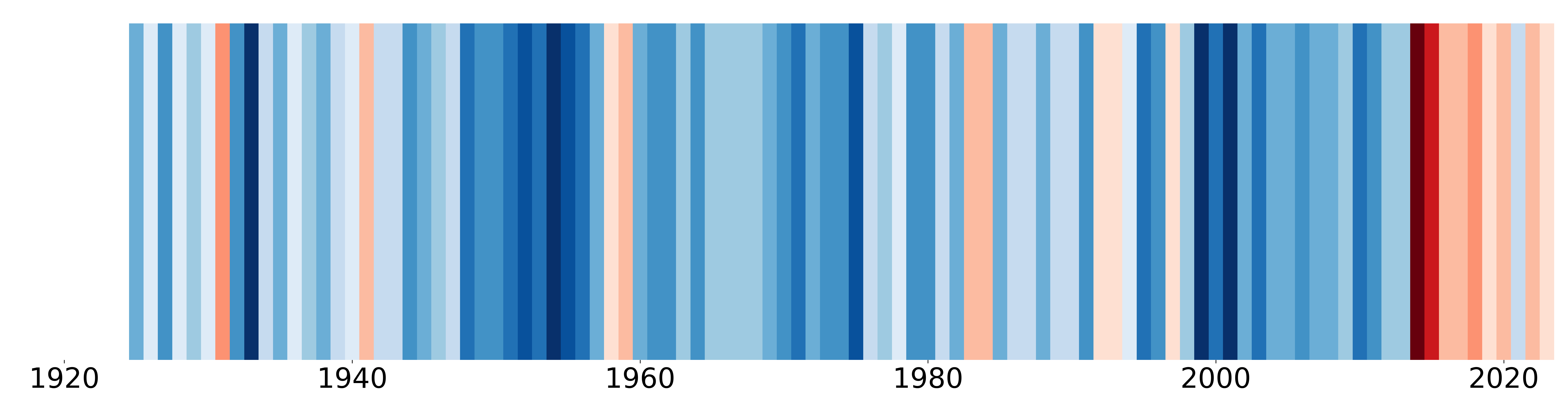
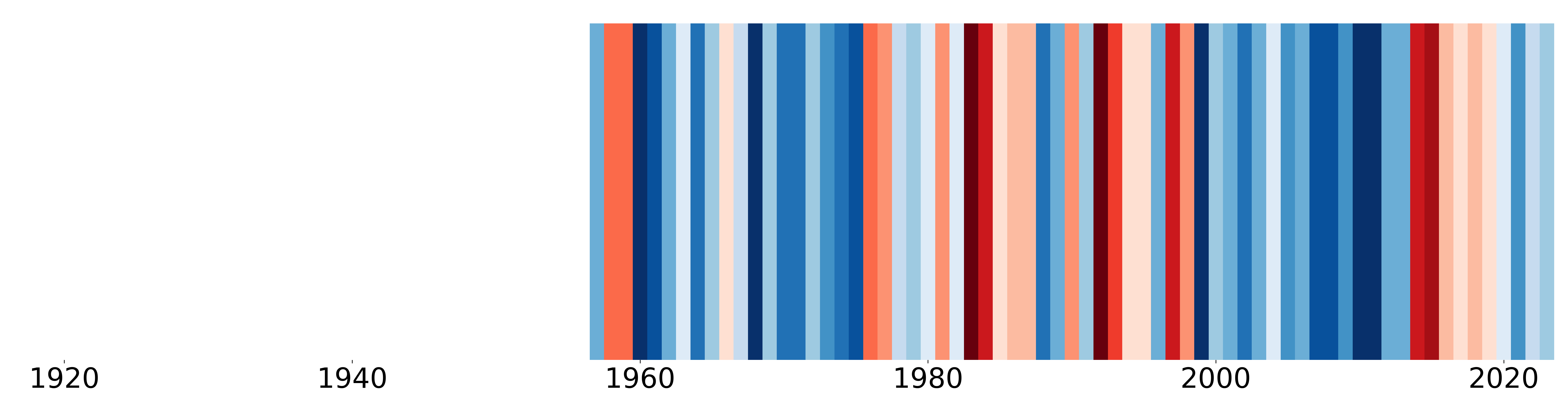
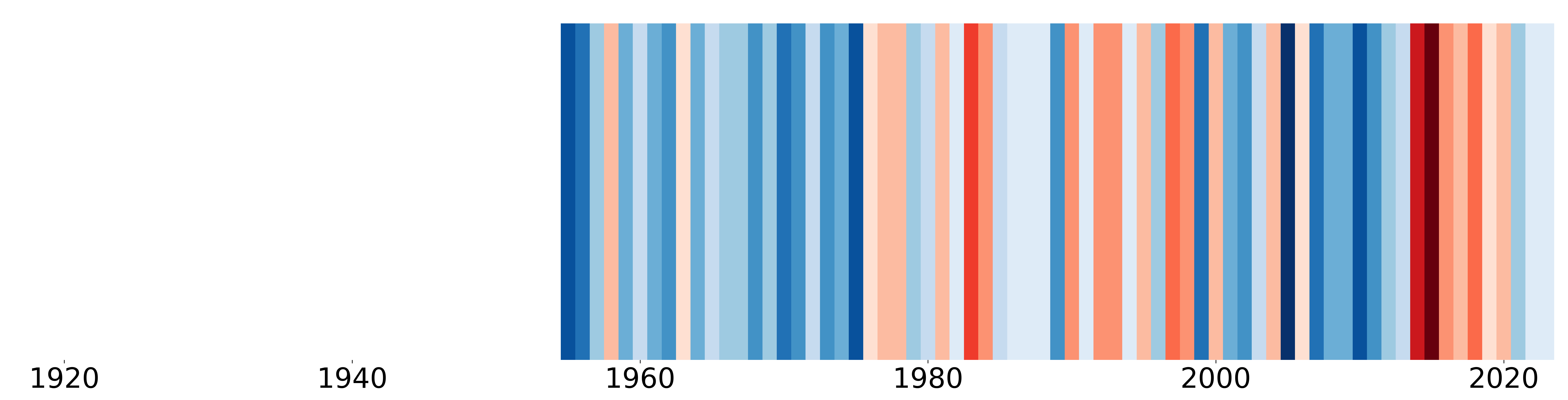
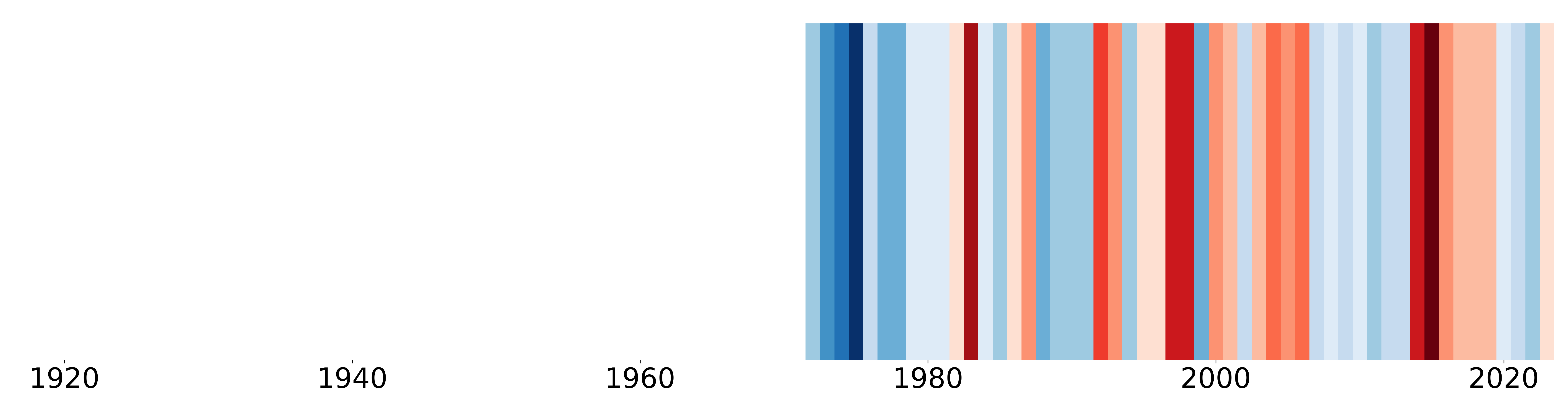
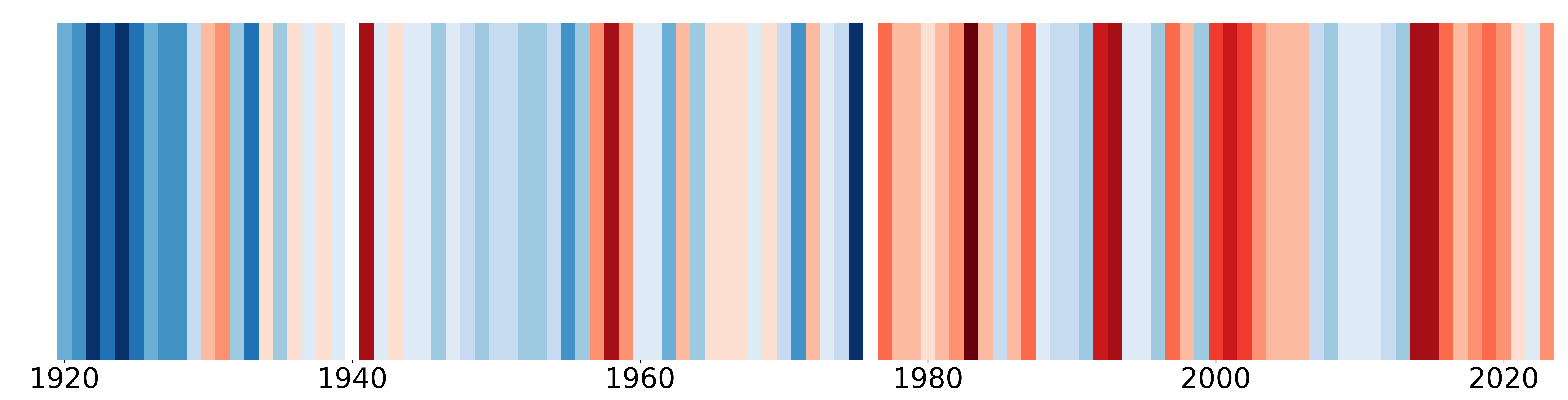
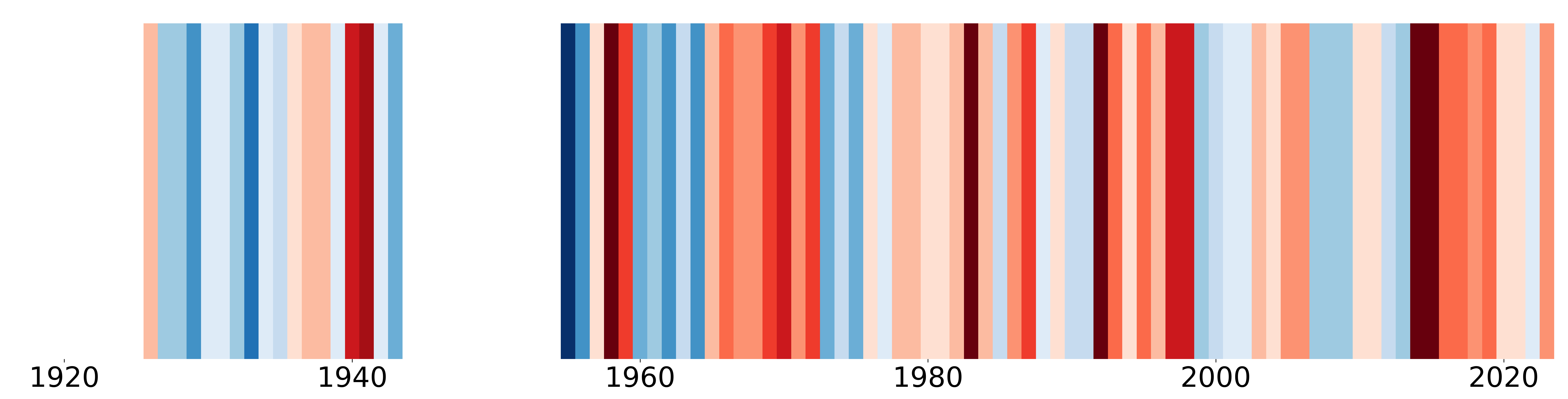
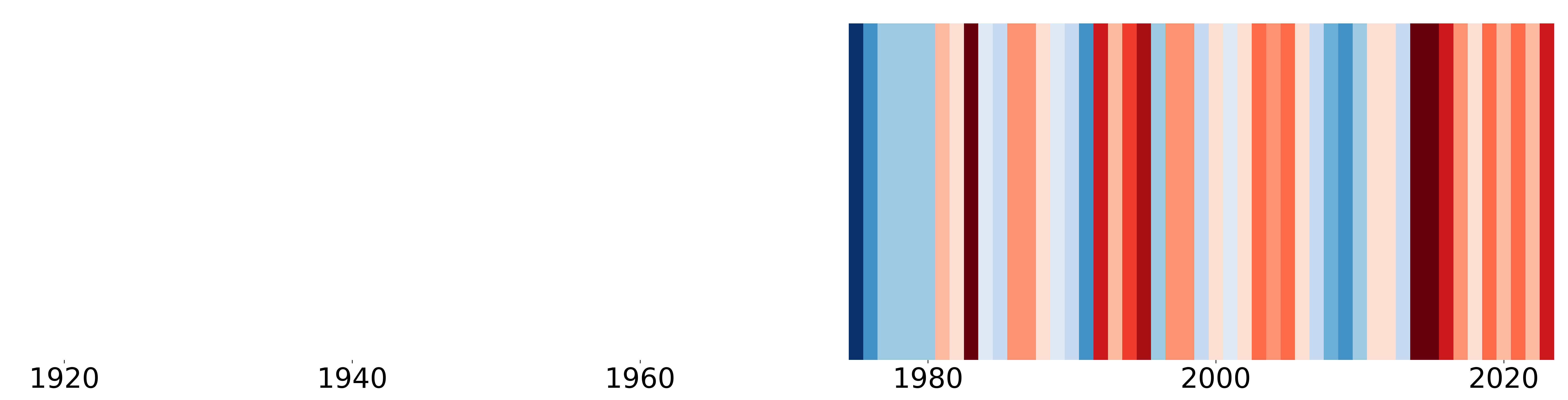
We have used ‘warming stripe’ graphics to help us visualize how sea surface temperature has changed throughout time at our Shore Stations. Each stripe or bar represents a year and the color represents the ocean temperature relative to the long-term average (anomalies). Blue stripes represent colder years and red warmer years; the darker the color the greater the difference from the long-term average. #ShowYourStripes - The Show Your Stripes campaign was created by Ed Hawkins.
Do you want to create your own #ShowYourStripes visualization? Click here to view instructions.
Check out the #ShowYourStripes plots for each of the Shore Stations:
Scripps Pier, La Jolla - Sea Surface Temperature
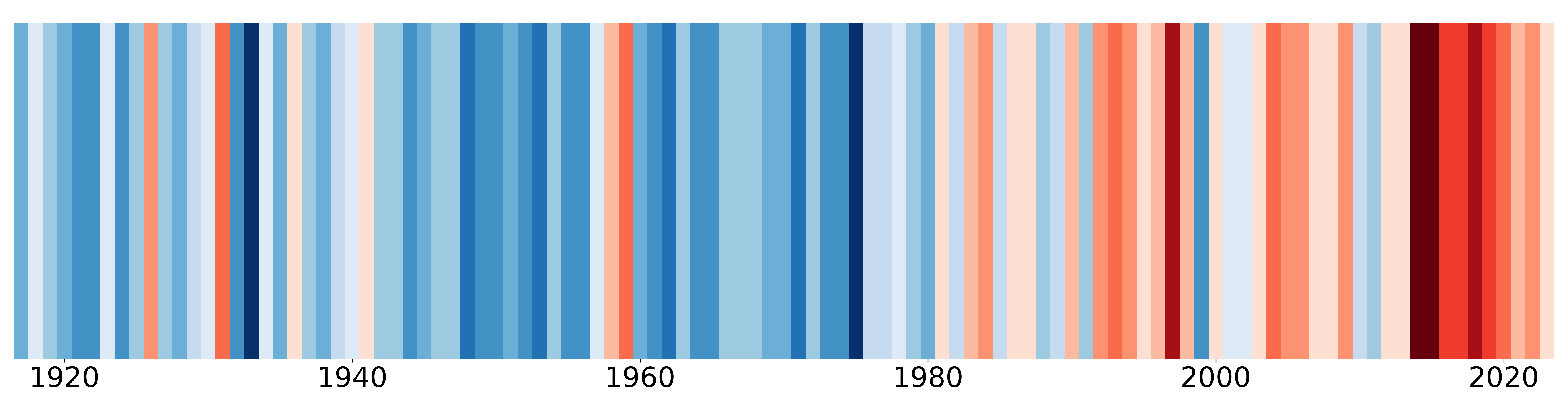
Scripps Pier, La Jolla - Sea Bottom Temperature
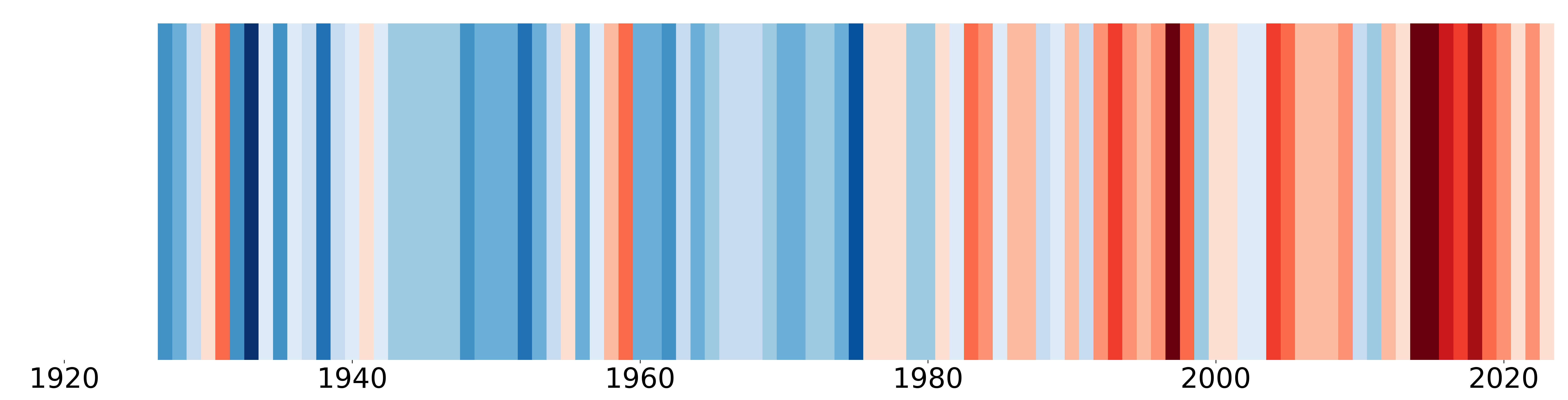
San Clemente
Newport Beach
Zuma Beach
Santa Barbara
Granite Canyon
Pacific Grove
SE Farallon Island
Trinidad Beach
Trinidad Bay